Friday, 29 April 2016

Kerrang! Contents Structure


After observing conventions of existing contents pages, I saw the yellow and black style for the titles of each of the sections, and felt as though this could be applicable to my own. I also took inspiration from the titles of each of these sections, including news, features, and live categories, similar to that of Kerrang!


Thursday, 28 April 2016

Double Page Spread Title Font- aiiight fat


The reasoning behind choosing 'aiiight fat' as a font on both the front cover and the double page spread is to follow conventions of rap music and urban culture. This font has a spray paint style to it, conforming to the style of the rap and hip-hop genre, especially the extremely urban based sub-genre of grime.


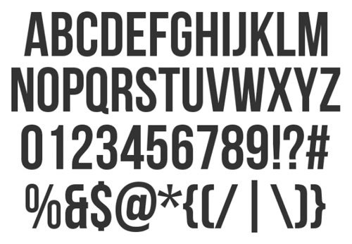
Masthead Font- bebas neue


I chose to use the font 'bebas neue' for the masthead on my front cover, as I felt as though a sans serif style font was necessary and conventional for a music magazine. I chose this font after looking at NME and the blocky style font that they use for their masthead, also taking inspiration from the colours used.


Wednesday, 27 April 2016

Rough Cut and Final Cut Comparison- Contents Page #2


Other, more minor yet important alterations that I made after the rough cut deadline include adding numbers to mark specific pages, rather than the beginning of each section, but keeping the white on black style by placing a black rectangle behind where all the numbers are. I feel as though this made the page easier to navigate and understand. 
Also, I changed the colour of the artist's names to red (fitting in with the house style), and in smaller text gave a short synopsis of the story. This made the artist's names jump out more, making the main appeal of a music magazine's contents page (to look for stories about particular artists etc.) a lot more obvious, as well as making the contents list appear a lot more clear and set out.


Rough Cut and Final Cut Comparison- Contents Page #1


Throughout the creation of my contents page, the overall outcome was similar in structure and layout, however the main body of the page has changed quite a bit. One of the more obvious aspects that is different from the rough cut, is one of the pictures. My justification behind taking a new picture, is that I felt like having two pictures on the same page with an artist up against a brick wall is a bit repetitive, and so I decided to use the photo shoot room in order to take the photo. I felt as though this was beneficial, as the new picture is a lot stronger in my opinion.
Another obvious change that I have made is the inclusion of a 'note from the editor' section, where the content inside the magazine is summed up. Despite non of the magazines researched in previous posts featured one of these sections, I decided that I needed something in the gap beneath the pictures, and after looking through a copy of Kerrang!, I felt as though this would add more variety to the page.


Rough Cut and Final Cut Comparison- Front Cover #2

Another change that I decided to make, was to move the 'free CD' from the bottom right of the page and instead to have it further up the page, alongside adding a white circle behind it in order for it to fully conform to the colour scheme.
Also, after taking a look at a copies of magazines such as NME and Rolling Stone, and realised that it is typically more conventional to put the bar code at the bottom of the page, rather than just below the masthead

Rough cut front cover
Final cut front cover
NME cover

Rough Cut and Final Cut Comparison- Front Cover #1


One of the main ways in which I have altered my front cover after the rough cut, is by adding more stories, as well as changing the colours used to highlight each of the stories. On reflection, my rough cut was slightly empty, and there was a lot of space that needed filling up with content, and therefore adding more stories allowed a busier, and more pleasant to look at front cover.
Also, another alteration that I have chosen to make, is to remove the picture at the bottom right of the corner. This is because, in much of my rough cut feedback, it said that it seemed slightly out of place, as well as proving unconventional for a music magazine for a cut out image of a person to be on the front cover. 

Tuesday, 19 April 2016

Double Page Spread Image #2 Analysis


When preparing to take this image, the two main concerns that I had was the facial expression and the background/setting of the image. The facial expression of the artist in the picture is quite cocky and arrogant, which through my market research I have found to be a common convention of attitudes in rap music. Alongside this, with the background being a brick wall, there are connotations of aspects of urban music that suggest he is based in the city, where typically, rap and particularly grime music is most commonly associated with.

This picture is at the bottom right of the page, and is just under the text of the article within the transparent black box. I chose to do this because after writing the article in Microsoft Word, it wasn't long enough to cover all of the space for the text, so I filled up the space with this picture. This also allows the reader to see the face of the artist on the page, as in the main image, his face is covered.


Contents Page Image #2 Analysis


When planning taking this image, I intended on taking a mid-shot, to include both the artists face and some of his clothing. The reason why I intended on being inclusive of the artist's body is to allow for aspects of genre identity to be present, and to show to the reader that because there is a hip hop artist on the front that doesn't necessarily mean that all artists follow conventions of one particular genre. This is indicated through the casual costume that he is wearing, suggesting that the music he makes is perhaps more accessible than the music made by other artists in my magazine. 

Also, the background was also an important thing to consider before taking the photo. I feel as though the simplicity of the brick wall as a background reinforces the idea of accessibility to the artist, as well as forming connotations that suggest he is an artist that comes from the city and has a fairly urban sound.


Contents Page Image #1 Analysis


This is one of the two images that I have decided to use on my contents page, and is one of my favourite pictures that I have taken for my magazine. Initially, the image was too bright, making it difficult to see the image in all of its detail. Because of this, I had to manipulate the photo to get it how it is now. I did this by using the auto contrast option on adobe Photoshop, and this automatically made the image a lot more clear and defined, with important parts of the image such as the microphone and the chain a lot clearer.

This image conforms to common aspects of hip hop culture, particularly through the costume he is wearing. The chain and watch both conform to the archetypal hip hop artist, who wears jewellery and is very concerned about material possessions, and therefore this makes the reader aware of the genre and the artist's implied ideologies.

To add to this, the rule of thirds is deliberately present in this image, with the centre of the image focusing on the microphone, as well as the artist's face being prominently placed slightly above the centre in the middle of the image. This implies that the most important aspect of the artist is in fact the music, symbolised by the microphone.



Monday, 18 April 2016

Post Rough Cut Feedback


After the initial rough cut deadline, I got feedback from other students on both positives and negatives of my magazine. This proved insightful, and helped me make the decisions that I needed to make in order for my magazine to progress. The action plan that I formed after the feedback included things such as 'experiment with layout of features on front cover', as well as 'experiment with fonts used for writing in DPS'. Both of these I managed to complete, as I did a complete realignment of the features on the front cover of the magazine, as well as sorting the problem I had with the visibility of the font on my DPS by changing the colour of the text to white, and placing a partly transparent box behind the article. Alongside this, I said 'use colour to highlight artist's names on contents page' in my action plan, but, instead of doing this I increased the size of the font of the artists name in order to make it stand out, as this appeared to be much more neat and organised than if I were to change the colour of the font specifically for the names.


Saturday, 9 April 2016

Double Page Spread Image Analysis


This image that I have used for my double page spread was taken shortly after the image used for the front cover, and was taken in the same location. Perhaps this may allow the reader to make the connection between the main image on the front of the magazine, and the one used in the DPS, making both the location and the colours etc consistent on both images which makes the artist easier to identify in the magazine.

Before taking the photo, I considered the layout of my double page spread and thought about how I can fit the heading, subheading and text on the page without it interfering with the image. I had this in mind while taking the photo, so I stood at a distance away from the person in order for there to be space surrounding him.


Friday, 1 April 2016

Front Cover Image Analysis


This is the image that I have used on my front cover, and is therefore the most important and prominent image in the whole of my magazine, and because of this I had to put quite a lot of thought into the taking of this photograph. When going about finding an area to take this photo, I didn't have to look far, as this was within the school where I found this location. The background is a large metal container, and one of the reasons why I decided to choose this location, is because of the paint coming off, giving it a more run down and urban feel, echoing the connotations that grime music holds.

Also, the framing of the shot was important to take notice of, and here I deliberately have the actor positioned slightly to the left side of the frame. This is because, on my magazine front cover the list of features and artists will mostly be on the right side of the page, and therefore this gives more room for important text.