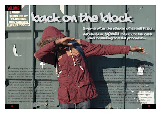
Another way in which I used Photoshop is by putting the artists head over his body in order for it to appear that he is in front of the title. I did this by carefully cutting out the head and aligning it on top of the model, making it appear as though there has been no manipulation.
Tuesday, 3 May 2016
Using Photoshop #1
One of the images that I had taken was too bright and made the image difficult to see, so I decided to use the auto contrast tool to change the brightness, enhancing the image, making it more defined and clear.
Audience Research Results
Before I began making my magazine, I conducted research in order to find out some important information that would influence decisions regarding my magazine. Here are the results:
Monday, 2 May 2016
Other Image
Here is one of the images that I used on my rough cut, but didn't decide to keep in for the final cut. This is because I feel as though the image is slightly too white and the light makes it slightly difficult to see, so instead I took another photograph and replaced it.
Problems #3
On one of the days that I had booked to take the camera out during lesson time, I had planned to take some pictures outdoors. However, it was raining and I was therefore unable to take the camera outside.
Double Page Spread Initial Sketch
This is the drawing that I made, planning the contents on my double page spread before I began creating it.
Problems #2
Another problem that I faced during the creation process of my magazine, was getting into the photo shoot room. I went to take pictures of a model at lunchtime, however the door was locked and I was unable to find a key. This slightly delayed the photo taking process.
Problems #1
One of the most frustrating issues that I came across was with Adobe Photoshop, which was, throughout the creation of my magazine incredibly slow and unresponsive. This made it difficult to alter and manipulate photographs that I had taken.
Booking Cameras
Here you can see the three bookings that I made for cameras prior to my photo shoots. As you can see, I chose to work in a group when taking pictures, I found this easier as we have each other feedback and criticism on the photographs, as well as new ideas in order to make the pictures the best they possibly could be.
Sunday, 1 May 2016
Rough Cut and Final Cut Comparison- Double Page Spread #2
Other minor changes include alterations to the colour of the text, as well as adding a transparent black box in order for the text to be more clear against the background. In my rough cut feedback, it was said that the text wasn't clear enough, and was difficult to read due to the shadow in the photo, and therefore I acted on the feedback with the changes that I have made.
Rough Cut and Final Cut Comparison- Double Page Spread #1
Throughout the creation process of my double page spread, I have made changes that further the conventionality of the page, some of which are more minor than others. One of the main alterations that I have made is the inclusion of a drop quote, highlighting an important part of the interview. I chose to do this as my article wasn't long enough to have three rows of text, and so including a drop quote fills up some some of the space where the writing is.
Also, I decided to add another picture to the article, and after swapping the image in the bottom right with a new image for the contents I felt as though it would be effective to include an image which shows the artists face to give readers unaware of the artist familiarity with his appearance.
Subscribe to:
Comments (Atom)


