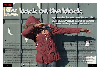
Other minor changes include alterations to the colour of the text, as well as adding a transparent black box in order for the text to be more clear against the background. In my rough cut feedback, it was said that the text wasn't clear enough, and was difficult to read due to the shadow in the photo, and therefore I acted on the feedback with the changes that I have made.


No comments:
Post a Comment