Sunday, 1 May 2016

Rough Cut and Final Cut Comparison- Double Page Spread #1


Throughout the creation process of my double page spread, I have made changes that further the conventionality of the page, some of which are more minor than others. One of the main alterations that I have made is the inclusion of a drop quote, highlighting an important part of the interview. I chose to do this as my article wasn't long enough to have three rows of text, and so including a drop quote fills up some some of the space where the writing is.
Also, I decided to add another picture to the article, and after swapping the image in the bottom right with a new image for the contents I felt as though it would be effective to include an image which shows the artists face to give readers unaware of the artist familiarity with his appearance.


Friday, 29 April 2016

Kerrang! Contents Structure


After observing conventions of existing contents pages, I saw the yellow and black style for the titles of each of the sections, and felt as though this could be applicable to my own. I also took inspiration from the titles of each of these sections, including news, features, and live categories, similar to that of Kerrang!


Thursday, 28 April 2016

Double Page Spread Title Font- aiiight fat


The reasoning behind choosing 'aiiight fat' as a font on both the front cover and the double page spread is to follow conventions of rap music and urban culture. This font has a spray paint style to it, conforming to the style of the rap and hip-hop genre, especially the extremely urban based sub-genre of grime.


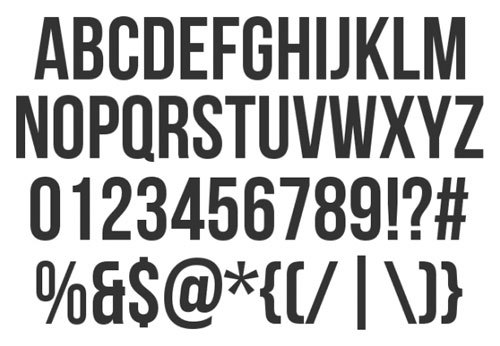
Masthead Font- bebas neue


I chose to use the font 'bebas neue' for the masthead on my front cover, as I felt as though a sans serif style font was necessary and conventional for a music magazine. I chose this font after looking at NME and the blocky style font that they use for their masthead, also taking inspiration from the colours used.


Wednesday, 27 April 2016

Rough Cut and Final Cut Comparison- Contents Page #2


Other, more minor yet important alterations that I made after the rough cut deadline include adding numbers to mark specific pages, rather than the beginning of each section, but keeping the white on black style by placing a black rectangle behind where all the numbers are. I feel as though this made the page easier to navigate and understand. 
Also, I changed the colour of the artist's names to red (fitting in with the house style), and in smaller text gave a short synopsis of the story. This made the artist's names jump out more, making the main appeal of a music magazine's contents page (to look for stories about particular artists etc.) a lot more obvious, as well as making the contents list appear a lot more clear and set out.


Rough Cut and Final Cut Comparison- Contents Page #1


Throughout the creation of my contents page, the overall outcome was similar in structure and layout, however the main body of the page has changed quite a bit. One of the more obvious aspects that is different from the rough cut, is one of the pictures. My justification behind taking a new picture, is that I felt like having two pictures on the same page with an artist up against a brick wall is a bit repetitive, and so I decided to use the photo shoot room in order to take the photo. I felt as though this was beneficial, as the new picture is a lot stronger in my opinion.
Another obvious change that I have made is the inclusion of a 'note from the editor' section, where the content inside the magazine is summed up. Despite non of the magazines researched in previous posts featured one of these sections, I decided that I needed something in the gap beneath the pictures, and after looking through a copy of Kerrang!, I felt as though this would add more variety to the page.


Rough Cut and Final Cut Comparison- Front Cover #2

Another change that I decided to make, was to move the 'free CD' from the bottom right of the page and instead to have it further up the page, alongside adding a white circle behind it in order for it to fully conform to the colour scheme.
Also, after taking a look at a copies of magazines such as NME and Rolling Stone, and realised that it is typically more conventional to put the bar code at the bottom of the page, rather than just below the masthead

Rough cut front cover
Final cut front cover
NME cover