Tuesday, 22 March 2016

Double Page Spread Rough Cut Analysis


When creating the rough cut for my double page spread, I have taken inspiration and attempted to apply common conventions of existing music publications, of which are shown in earlier posts. One of the main ways I have tried to incorporate these features is through the use of fonts that are associated with the genre of music being written about - in this case grime/rap music. The graffiti style used for the heading and sub-heading is used also on the front cover, making it obvious to the reader that the main feature shown on the front cover is this article. 

Another minor, yet conventional aspect of my rough cut double page spread is the red on black 'Volume' logo, as well as the same colours for the page numbers in the bottom corners of the page. This allows a house style to be obvious throughout the magazine, rather than just the front page and contents, where the colour scheme of the magazine is typically more obvious. 


Saturday, 19 March 2016

Contents Page Rough Cut Analysis

In the rough cut for my contents page, I have tried to apply aspects of contents pages that I have researched in previous blog updates. When it comes to house style, through the red on black colour scheme, I have tried to make the magazine's brand identity obvious as well as giving the layout of the magazine as a whole more coherence. Also, I have included the issue number just below the 'contents' title, which allows the reader to see that the magazine has had longevity and therefore implies that it is reliable.

Also, I have decided to make the numbers which indicate what page each feature is on white, as it contrasts greatly with the black background it is on, making it stand out to the reader, in turn giving the contents page practicality as it is easy to navigate the magazine.

Some of the improvements that I am planning to make however, is to change the top left picture for one with a different background, as I feel as though having a wider range of backgrounds would make the images seem less generic. Also, in the bottom left of the page I am considering adding a short 'note from the editor'. One of my reasons behind this is to decrease the amount of empty space on the page, but also because in contents pages that I have analysed previously, there was more written content than there is on this.

Thursday, 17 March 2016

Front Cover Rough Cut Analysis


In the rough cut of my front page, I have attempted to include codes and conventions of existing magazines that I have looked at in previous posts. One of the main ways in which I have abided by these conventions is through a distinct colour scheme and house style, settling on red and black to be the two main colours used for the house style of my magazine. Another aspect of my front cover that complies to the codes and conventions of existing publications, is the use of fonts that relate to the genre of music of which the artist belongs to. In this case, the font I have used for 'Yemzi' is in a graffiti style, which portrays the typical ideals and style of grime music. This allows for an audience that may be unaware of the artist, yet familiar with the 'visual' style of the genre to be engaged by the front cover. Also, the layout of the page is conventional in that the features listed are around the edge and bottom of the page, however I am planning on adjusting the layout slightly in order to accommodate more features. 

One of the main adjustments that I am planning on making to my front cover is the layout of the features. This would include probably adding features etc. on the left hand side of the page, as well as readjusting the placement of the writing on the right side of the page, to make it appear more organised. Also, underneath the bar code I still need to add a price and issue number which will make the magazine appear to be more conventional. I am intending also on adding a banner right at the top of the page, as not only would that make the magazine more cohesive, but it also allows it to abide by the common properties of a music magazine more closely.


Tuesday, 15 March 2016

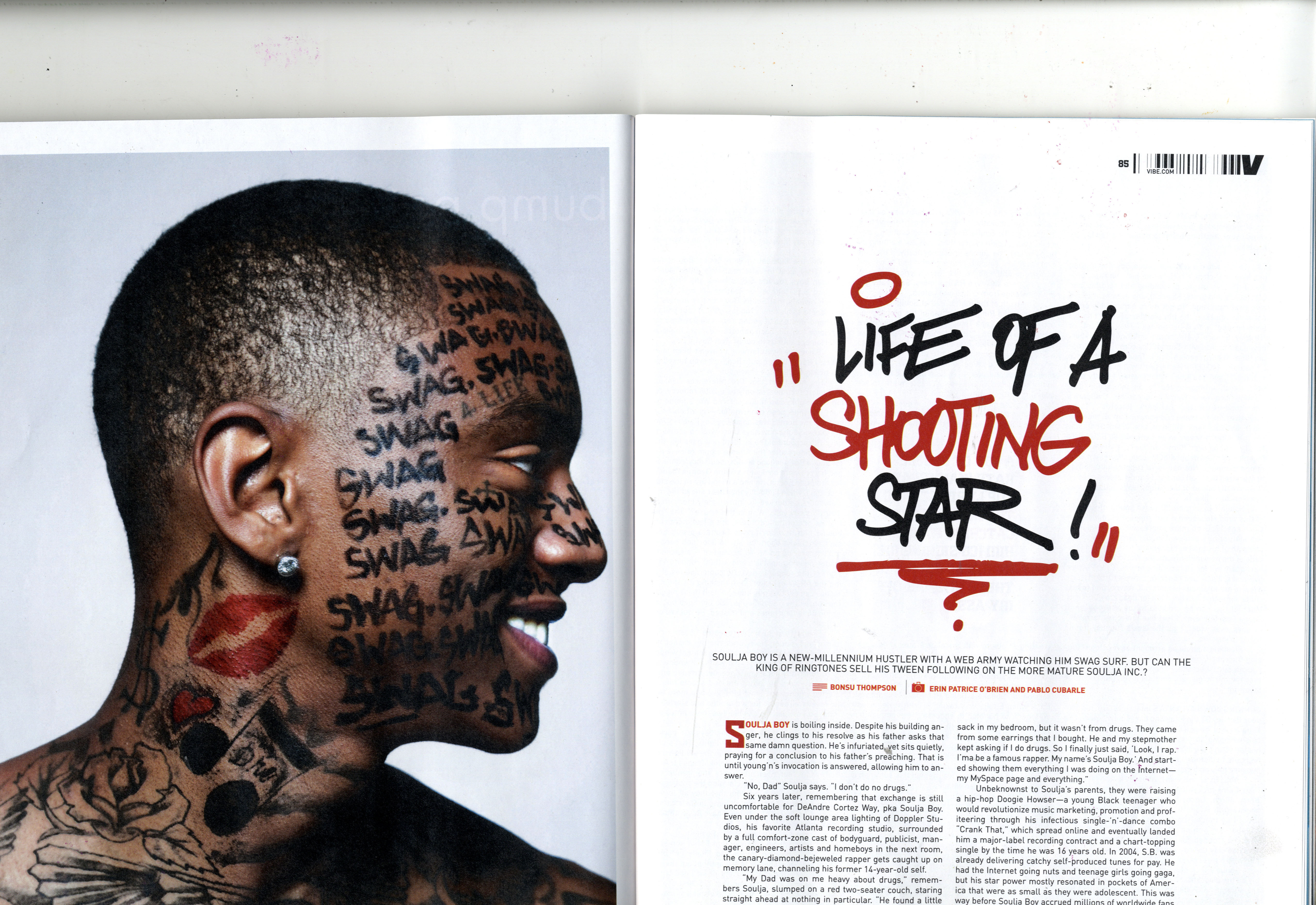
Vibe Double Page Spread Analysis


In this issue of Vibe, the double page spread has a large, close up image that covers the whole of the first page on the double page spread, and a title that takes up over half of the right side of the spread. Because of this, there is large amounts of white space surrounding the title, giving it a simplistic and minimalistic style that perhaps appeals to members of the audience demographic that are interested solely on the artist, as they may have an existing familiarity of the appearance of the artist. This is a common convention of double page spreads used by Vibe magazine, as in other issues it is often that close up shots are used for artists that the audience are most likely already familiar with. This allows the reader to have a more personal and intimate insight into the artist, rather than connoting distance and giving more of an impersonal impression to the reader.

Another interesting aspect of this double page spread is the use of fonts. The font used for the title of the article has a style similar to that associated with the type of music made by the artist, and this helps the reader to fully understand the genre of music that the artist belongs to, which may help persuade readers to become engaged in the article. In my magazine's double page spread, I am also going to use fonts similar to the genre of music that the artist belongs to on my double page spread. In my case, I am going to use a graffiti style font to match the grime genre of music that my main artist belongs to.


Rolling Stone Double Page Spread Analysis


In this double page spread, one of the main features that makes it an effective article is the colours used. The inclusion of the red on the American flag matches with the Florence's hair colour which provides a clean looking page due to the matching colours, and the limited amount of colours other than red. Also, rule of thirds is used on this page, with the point of which the lines cross marking the title of the article, the drop capital and Florence's chest area. In doing this, Rolling Stone is sexualising the artist in the spread, intentionally placing parts of her body in areas of the page that the reader is more likely to look at.

Aspects from this article that I may take inspiration from is the use of a drop capital, as well as having three columns of text to cater for the main content on the page. My reasoning behind using a drop capital to begin my article, is because it draws the reader to the writing on the article, and encourages them to read the writing in full, rather than just looking at the image and design of the page. The use of three columns of text provides a structured layout to the page, as well as giving enough space for an extended article on the page. 


Tuesday, 8 March 2016

Kerrang Double Page Spread Analysis

In this double page spread, the use of the colours black and white allow for a gothic style to be formed (which aligns itself with the typical reader of Kerrang), as well as putting a more feminine twist through the use of pink. Perhaps this was used with the intention of appealing to female members of the magazine's demographic, whilst still attracting a male audience through other colours used. This is reinforced through the similar colours used for the drop capital and the questions that are asked towards the features artists, of which not only helps to attract members of Kerrang's typical demographic, but also helps the organisation and fluidity of the structure and layout of the page. The image on this spread allows for connotations to be constructed of darkness and mystery, not only because of the predominantly black costume, but also because of the medium close up camera shot, which doesn't reveal all of her body and limits the presumptions that can be made of her. 


One way in which I may decide to apply properties of this double page spread to my own creation is the size and prominence of the image. Despite the image not showing a range of items or aspects of mise en scene, the image still takes up the whole of the left page and some of right part of the two pages. I have decided that the image I am going to use for my double page spread will be of similar prominence, most likely going across both pages, with the positioning of the text going around the image, placing primary focus on the artist.

NME Double Page Spread Analysis

In this double page spread, one of the interesting attributes is the use of red to highlight words of particular importance, such as the artist's name and the name of the writer of the article. The indication of red to imply importance is used once again in the costume worn in the image of the artist. This shows to the reader that the most important part of the feature is the artist, as well as making it easier to work out who the article is about for those readers unfamiliar with Lily Allen. The font used in the title is interesting as it is disjointed and almost choatic because of the differing sizes of the letters, which perhaps suggests that the artist may be slightly controversial, and consequently intrigues the reader.

One part of this double page spread that I may find useful to implement into my own, is the use of a drop capital at the beginning of the text. Also, one smaller aspect of the article that I have taken inspiration from is the page numbers, and the fact that there is white font on a red background, even though I have decided to use red on black instead in order to fit with the house style of my magazine. This allows for a discreet way to pursue their colour scheme of red and white, furthering brand recognition and contributing to the clear house style that is consistent throughout NME magazines.