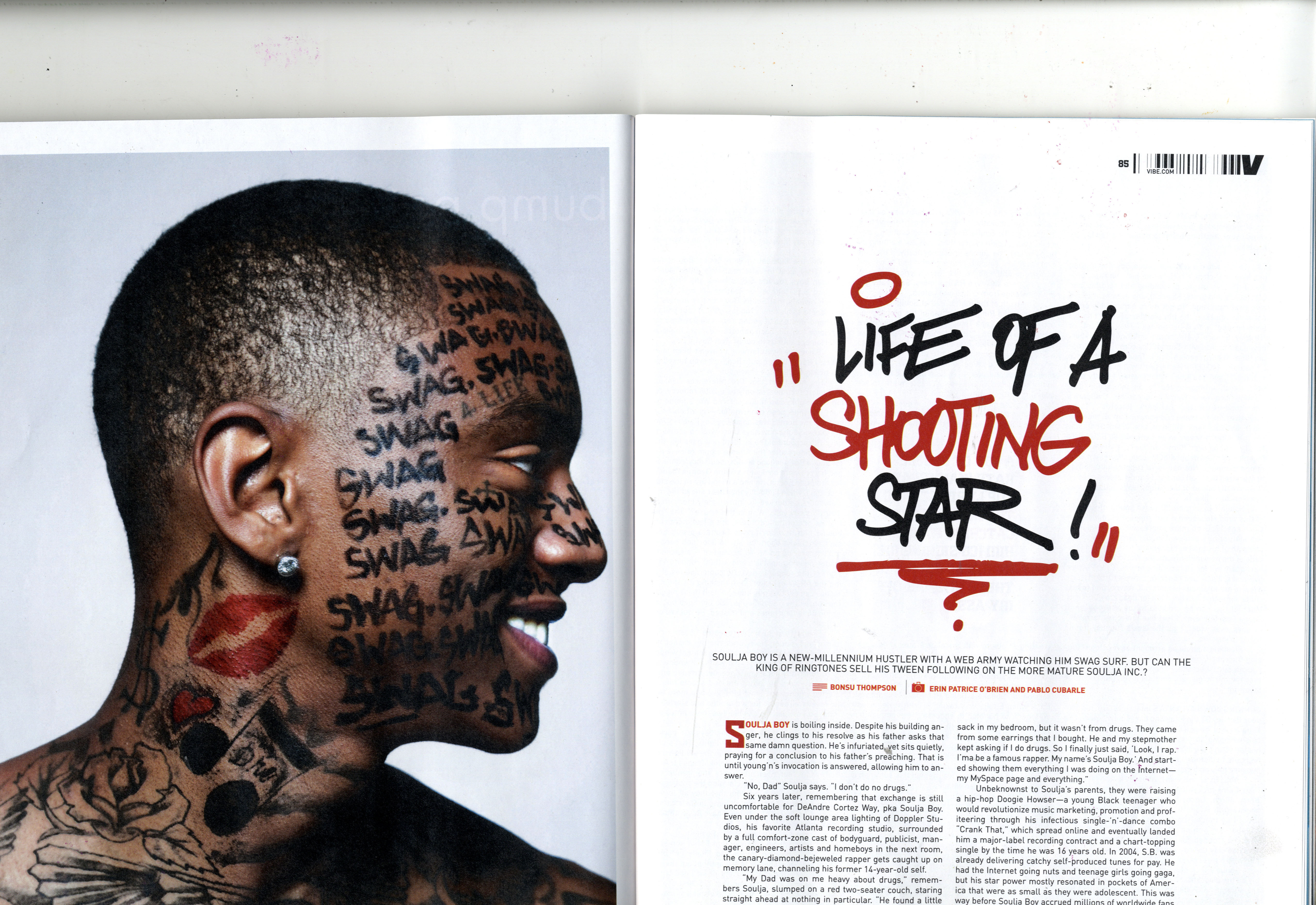
In this issue of Vibe, the double page spread has a large, close up image that covers the whole of the first page on the double page spread, and a title that takes up over half of the right side of the spread. Because of this, there is large amounts of white space surrounding the title, giving it a simplistic and minimalistic style that perhaps appeals to members of the audience demographic that are interested solely on the artist, as they may have an existing familiarity of the appearance of the artist. This is a common convention of double page spreads used by Vibe magazine, as in other issues it is often that close up shots are used for artists that the audience are most likely already familiar with. This allows the reader to have a more personal and intimate insight into the artist, rather than connoting distance and giving more of an impersonal impression to the reader.
Another interesting aspect of this double page spread is the use of fonts. The font used for the title of the article has a style similar to that associated with the type of music made by the artist, and this helps the reader to fully understand the genre of music that the artist belongs to, which may help persuade readers to become engaged in the article. In my magazine's double page spread, I am also going to use fonts similar to the genre of music that the artist belongs to on my double page spread. In my case, I am going to use a graffiti style font to match the grime genre of music that my main artist belongs to.

No comments:
Post a Comment