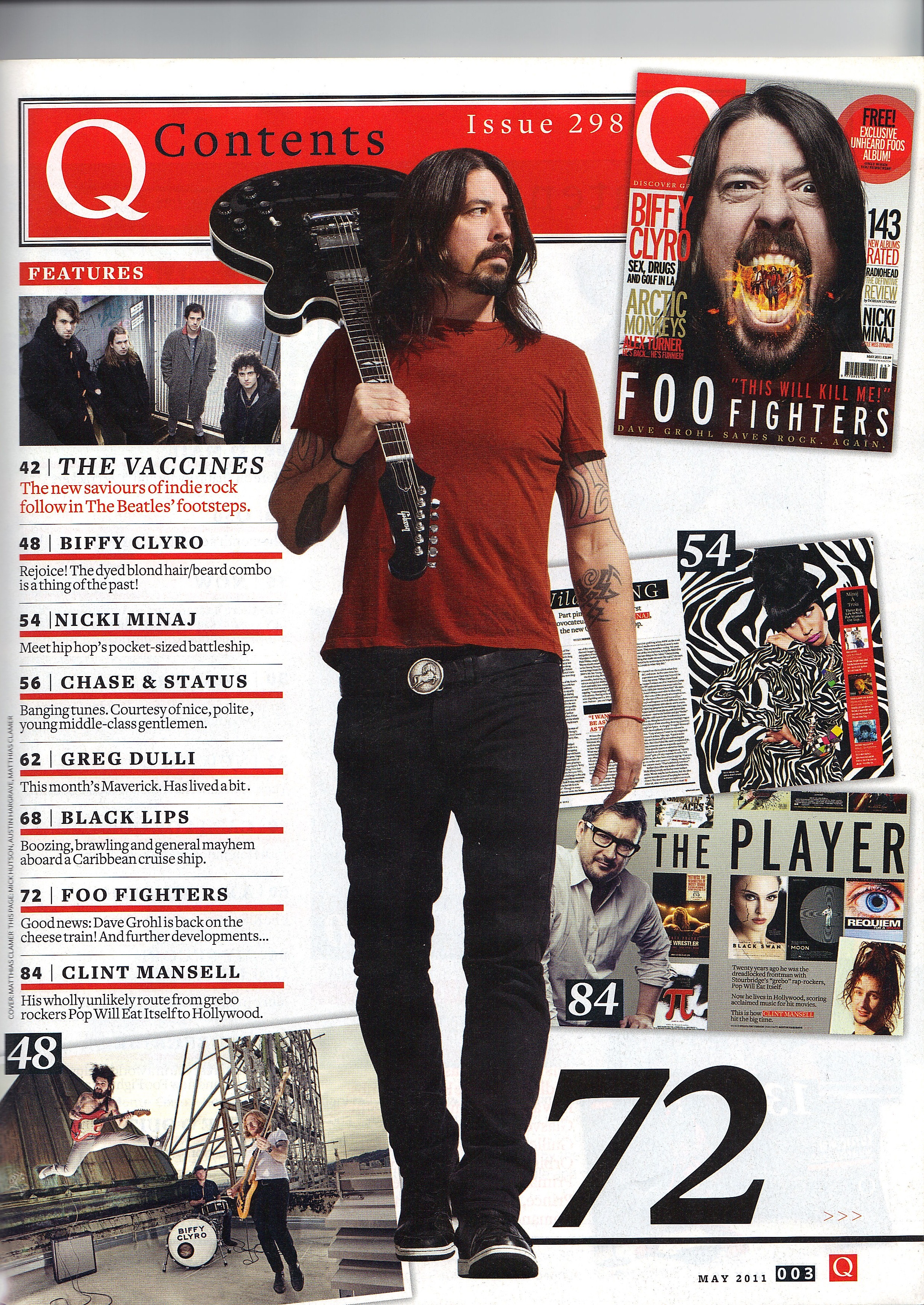
The masthead of this particular contents page relatively minimalistic, with the design being similar aligning itself with the consistent house style that Q often use in their magazines, however the issue number is in the top right and the familiar Q logo just to the left of the title. In this page, colour is used to good effect, with the colour red seemingly highlighting the important features and information that is on the page. As you can see, as well as the masthead having lots of red around it, there are red bars under all of the features, and even the main feature, Dave Grohl, is wearing red which not only allows him to appear as part of the house style of Q but also to have his importance to the issue to be highlighted.
One of the main aspects that I may use to influence my contents page is the use of house style to highlight the important features on the page. I haven't yet gotten to the stage of deciding what my colour scheme is going to be, but I think it would be good for my magazine if I also use colours to my advantage in order to point out to the reader what the important parts of the page are and draw their eyes towards these features.
No comments:
Post a Comment